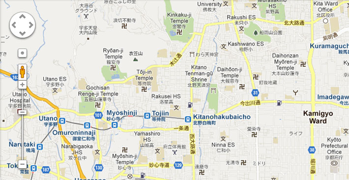
The other day while finding temples to add to our interactive map, I noticed something strange. I kept noticing the same symbol continuously popping up. This symbol was the manji, or as it is more commonly known, the swastika. Before World War II, the swastika was prominent in many cultures. It meant different things in each culture, but was often a sign of goodwill. However, in the past 80 or so years it has been consistently used as a symbol of hate. Because of that, most places have stopped using the symbol all together.
Now although the two symbols are similar, there is one key difference – the angle in which they are presented. The swastika is always angled to the side, while the manji is flat. This begs to ask the question – is this enough to differentiate the two? According to the GSI or (Geospatial Information Authority of Japan), it is not.
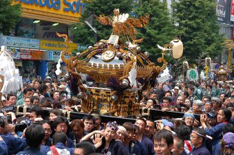
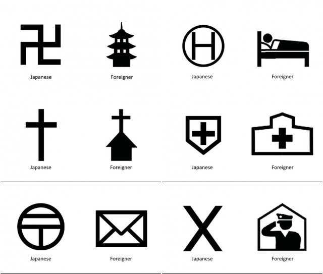
In the past few years, Japan has seen an overwhelming increase in tourism. Economists believe that with Tokyo being the home of the 2020 Olympic Games, this growth will only continue to flourish. In an effort to create a seamless experiences for incoming tourists, the GSI has decided to redesign six of the common symbols you see on maps. This will help tourists have a better understanding of where to find key points. However, out of the six new symbols, the replacement of one is causing quite a bit of controversy. This particular replacement is none other than the replacement of the manji with a three tiered pagoda.
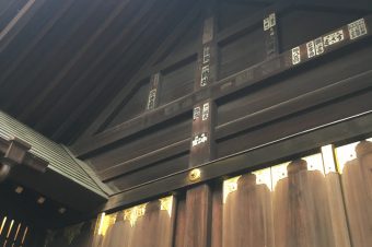
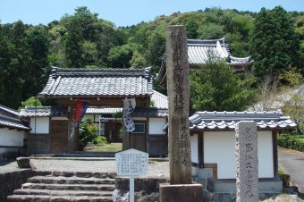
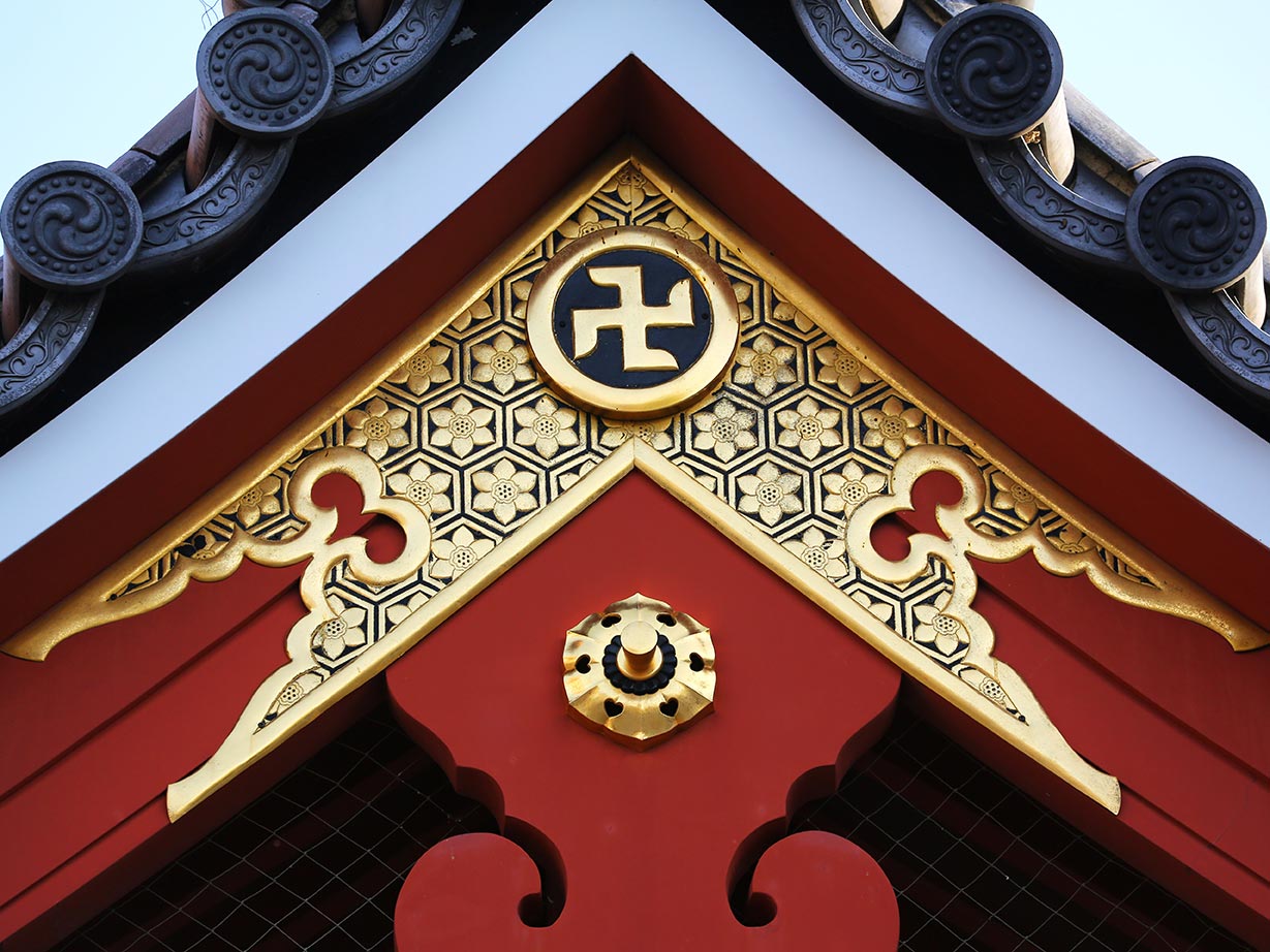 The use of the manji in Buddhist culture dates back thousands of years. In Buddhism, the manji is a symbol of good fortune, prosperity, abundance, and eternity. It is directly related to Buddha and can be found carved on statues on the soles of his feet and on his heart. It is said that it contains Buddha’s mind. Buddhists believed that having it on their temples was a sign of wellbeing and good luck. Many people believe that the symbol should stay the same because it not only honors the history behind the temples, but it encourages people to research and learn more about the history of Japan.
Personally, I am torn between deciding if they made the right choice to change the symbol. The history fan in me agrees that people should spend the time and actually learn about the culture and meaning behind the symbol. However, the tourism management major understands why they decided to change the symbols. I think it’s also important to take into account that the decision wasn’t made on a whim. The decision to replace the manji came after the GSI polled more than 1,000 people from 92 countries. These people consisted of tourists, embassy officials, and exchange students. They were asked numerous questions about the clarity of 18 symbols commonly used on maps. GSI then took their answers and made changes based on them. Amidst the controversy, I think it’s important to note that this will only be changed on the foreign maps. The manji that are featured on the temples will not be changed in anyway.
What do you think of the changes? Do you believe that it’s the right idea to change the symbol or should it remain the same? Let us know in the comments.